
Take a look at a few websites in the same industry, and you'll probably notice something familiar. Similar layouts, the same gradients, oversized headlines, floating UI elements, and predictable sections.
There's nothing necessarily wrong with that. But when every website follows the same design patterns, it's becoming harder to stand out.
Your website is often the first impression people have of your business. It should communicate more than just what your product does. It should give visitors a feel for who you are, what makes you different, and why they should remember you.
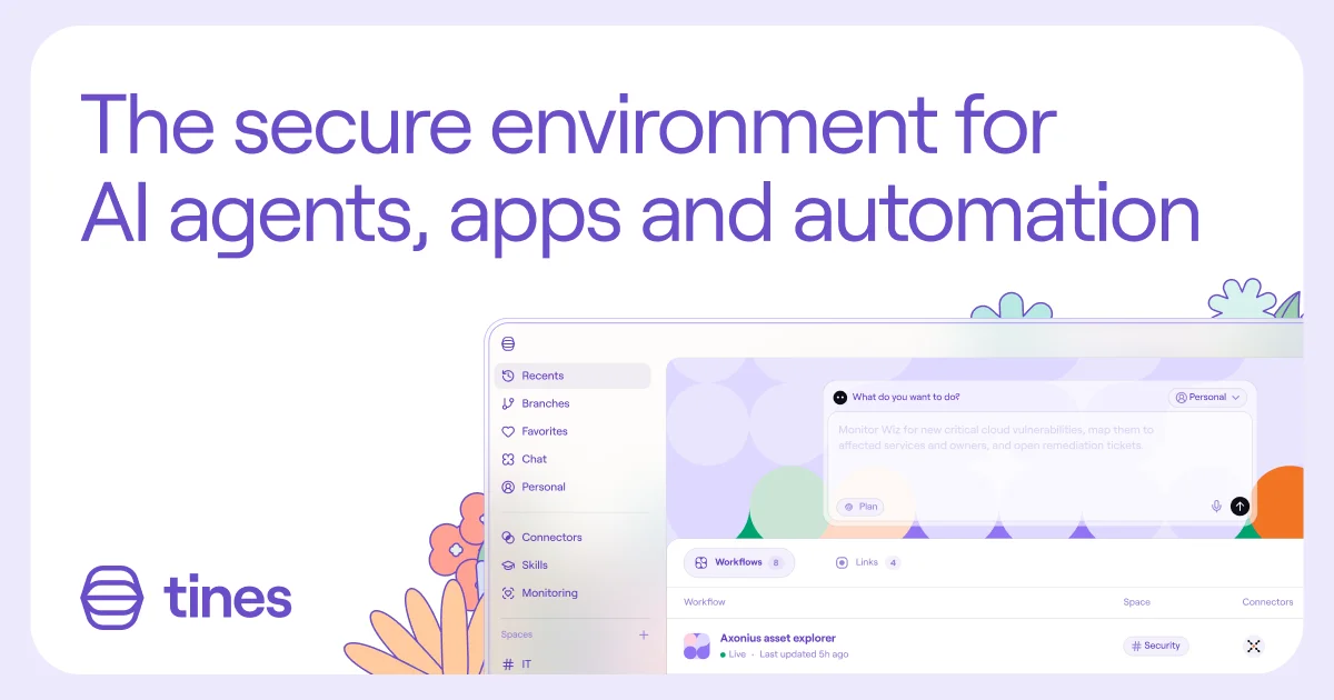
So, what makes a website feel more personal?
It starts with having a clear visual direction. Thoughtful typography, unexpected color combinations, distinctive imagery, subtle animations, and details that feel intentional rather than borrowed from another website.
It doesn't mean making everything flashy or adding interactions just for the sake of it. Sometimes it's as simple as choosing a different typeface, using real photography instead of generic stock images, or giving a layout a little more room to breathe.
The important thing is that every design decision feels connected to your brand and the product you're presenting.
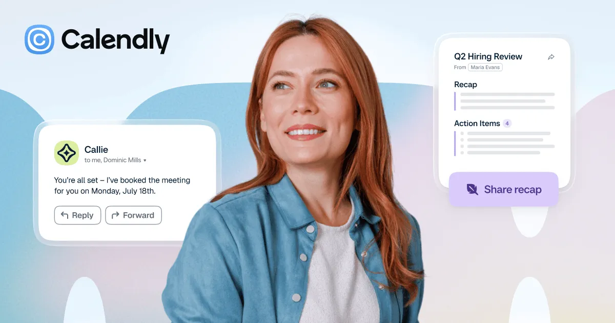
Don't just follow what everyone else is doing.
Trends can be a great source of inspiration, but they shouldn't dictate how your website looks. Your product, audience, and brand deserve an approach that feels right for them.
A good website should be easy to use, communicate clearly, and look great. But ideally, it should also leave visitors with something to remember.
Because at the end of the day, you don't want your website to be just another website in your industry. You want it to feel like yours.